Brand refresh + end-to-end participant redesign
Rebranding Respondent & redesigning the participant experience
Respondent is a two-sided marketplace connecting researchers with high-quality participants. I led the brand refresh and the end-to-end redesign of the participant product, from first sign-up to getting paid. Brand and product, crafted by hand well before AI was part of my workflow.
Chapter 01
A confident foundation: the rebrand
Before touching the product, we rebuilt the brand it stands on. Respondent had outgrown its old identity, and a modern, trustworthy brand needed to be in place before it could carry a redesigned product.
Modernising the brand, without losing the blue
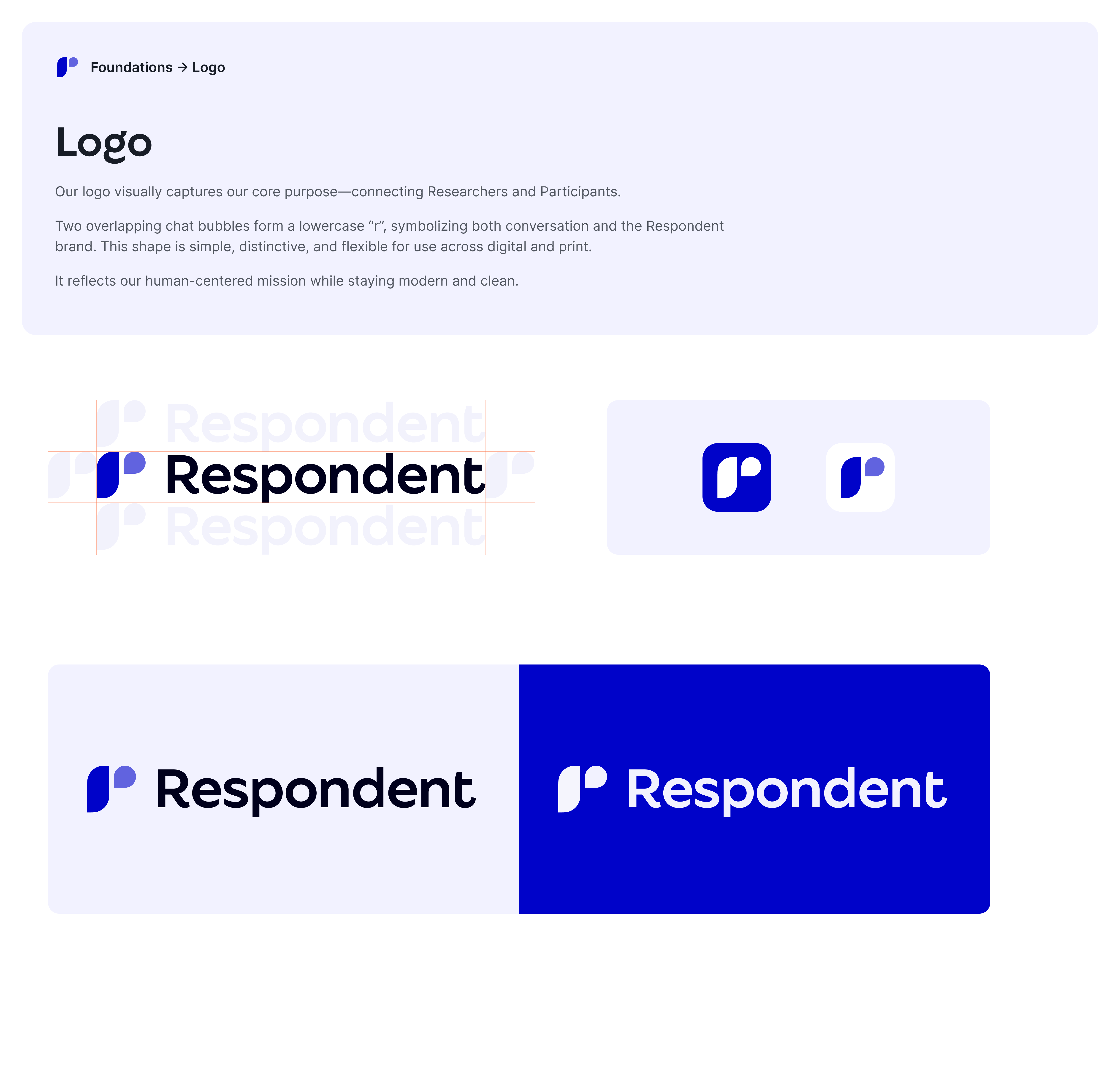
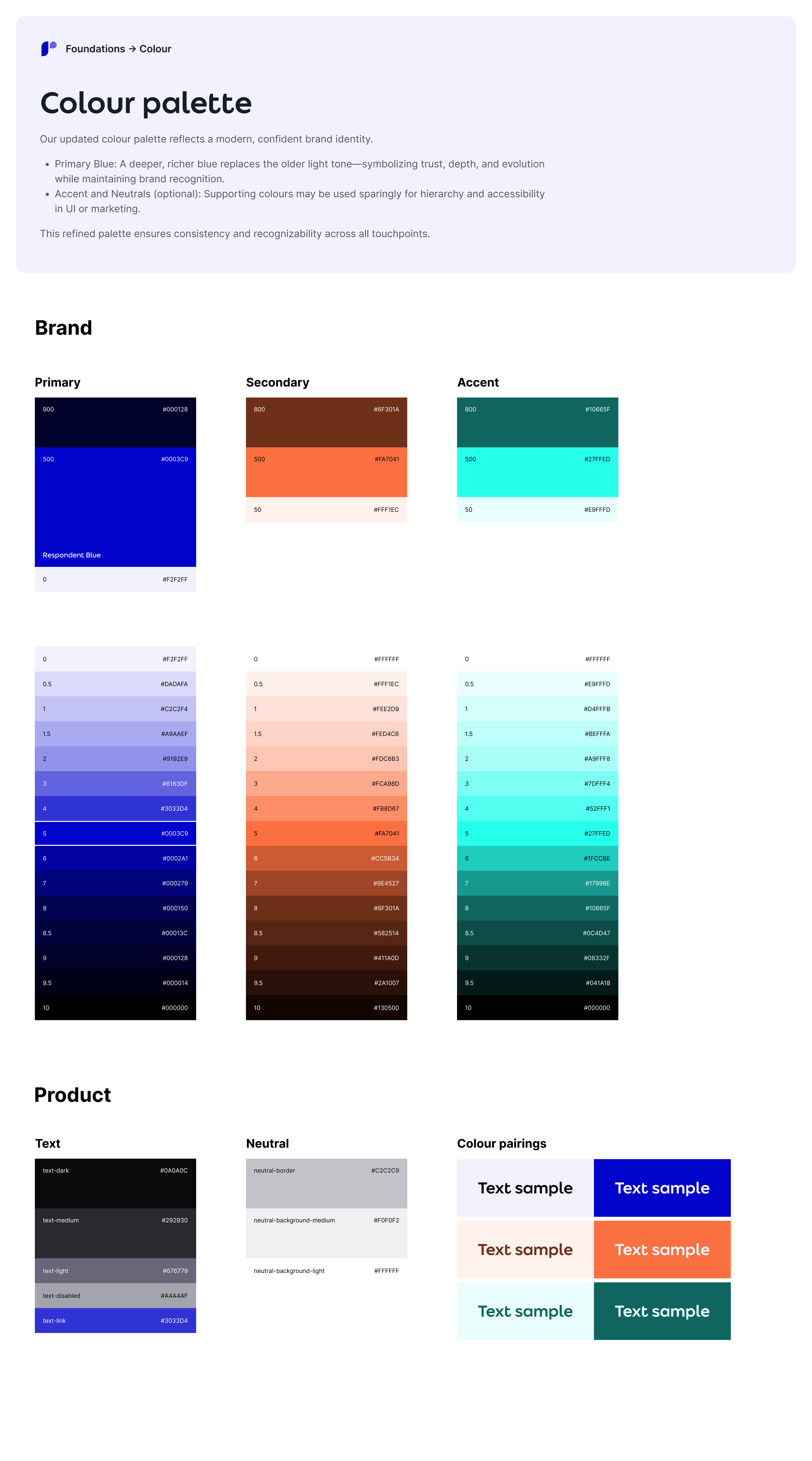
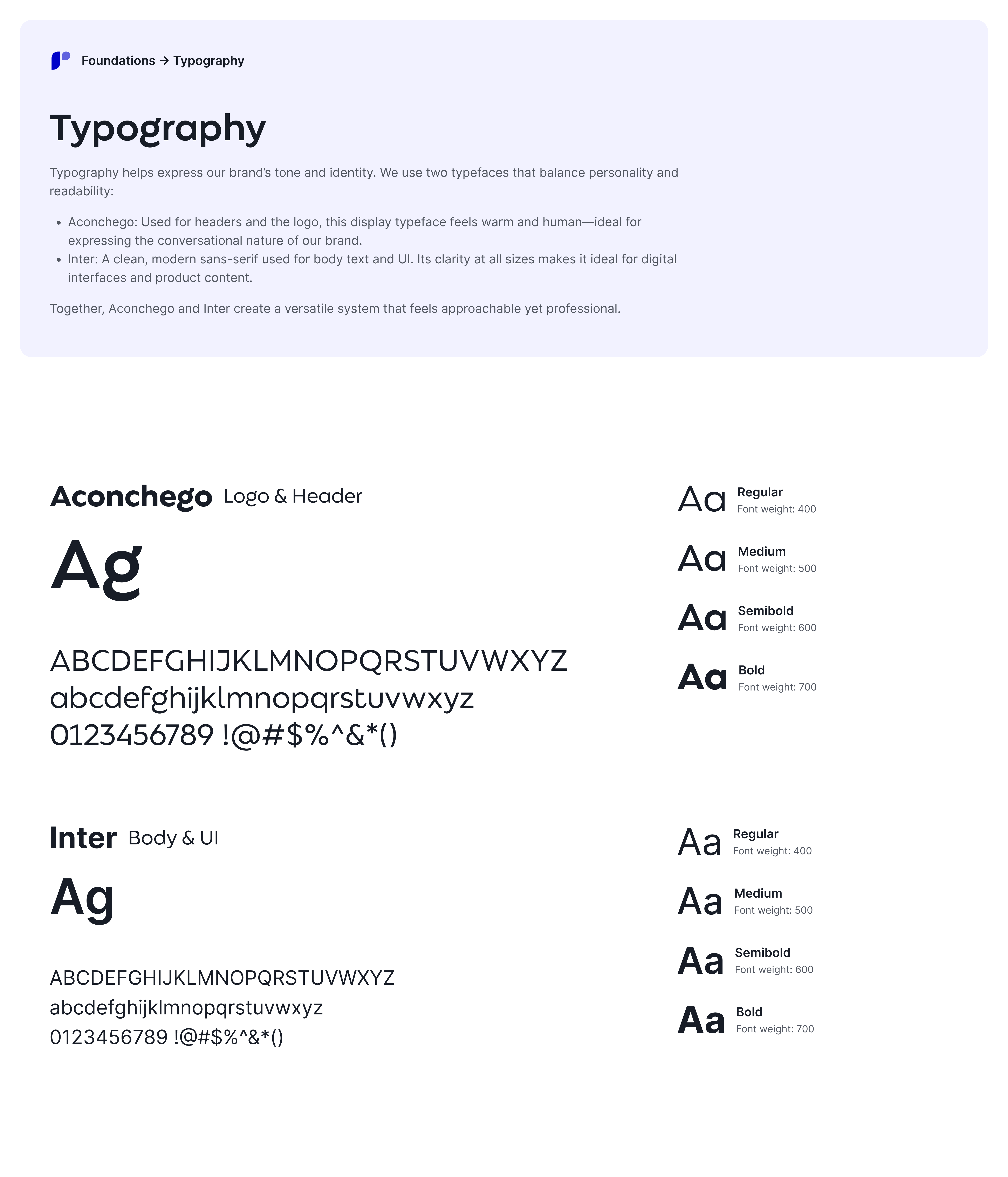
The old identity had started to feel dated: a washed-out light blue, a plain wordmark and ageing type made a platform trusted by teams at Canva, Anthropic and Stripe look less premium than it had become. Blue is the equity people recognise, so rather than walk away from it we deepened it, then modernised everything around it. The result feels current and trustworthy, yet still unmistakably Respondent.
Chapter 02
What participant research surfaced
Before redesigning a single screen, I ran interviews and surveys with participants to find where the old experience broke down. The same four problems kept coming up, and each one became a design priority that shaped the redesign.
Left in the dark after applying
Once someone applied to a project, they had no visibility into what happened next: invited, passed over, or simply waiting on the researcher.
Finding the right studies was hard
Browsing was slow and frustrating. Participants couldn't easily narrow down to the studies that were actually relevant to them.
Onboarding forced everything up front
New participants had to add all of their information before they could do anything, piling on friction long before they saw any value.
Project management was overwhelming
The old "My Projects" view dumped every project a participant had ever applied to, sometimes hundreds, with no sense of what mattered now.
Chapter 03
The new participant experience
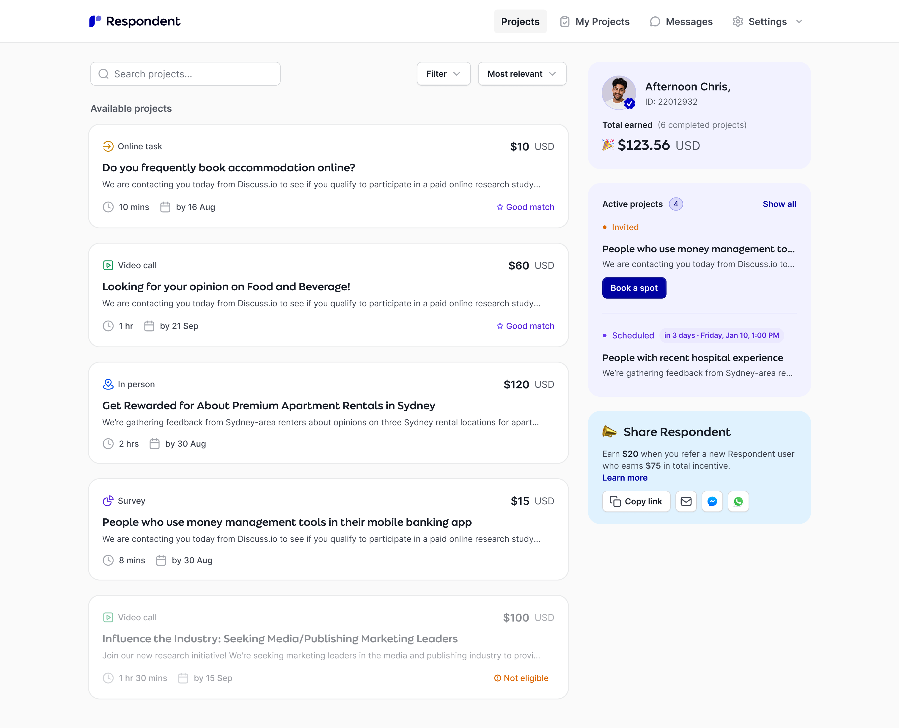
With those problems in hand, we redesigned the entire journey (sign-up, project discovery, screening, scheduling, messaging and payout) on the new brand foundations.
The journey, on one canvas
Every screen of the participant experience, interconnected. Solid arrows trace the core journey from sign-up to payout; dashed arrows are the profile and growth loop that feeds it. Drag to pan, zoom to taste, and hover any screen for the detail.
Hover any screen on the canvas to read how it works. Solid arrows are the core journey from sign-up to payout; dashed arrows are the profile and growth loop that powers matching and referrals.
Chapter 04
Where it landed
The rebrand and the participant redesign shipped as one coherent move: a brand that signals trust, and a product that earns it at every step of the journey.
Every problem the participant research surfaced has a shipped solution: visibility after applying, finding relevant studies, up-front onboarding friction, and project overload.
The whole journey redesigned end to end on the new brand foundations, including the profile loop that powers matching, instead of a patchwork of screens.
Brand foundations now drive every surface, from app to lifecycle email, and a healthier participant marketplace means better liquidity for researchers.